Home → The Classics → Blog
Let a website be a worry stone.
Published: Updated:
See Let a website be a worry stone. on ethanmarcotte.com
So three years after writing this post I’ve redesigned my site over 100 times! Redesigning this site is basically my stress ball.

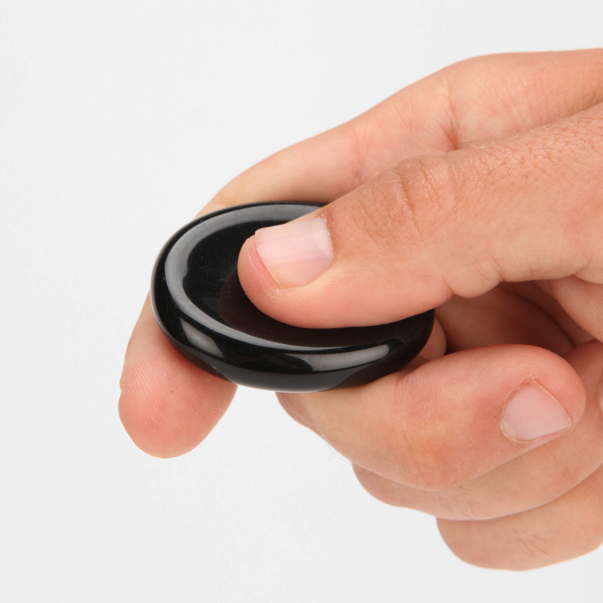
A worry stone is a small stone various cultures have used to relieve anxiety. Image by Sergey Krasilnikov on Wikimedia under the CC-BY-4.0.
While I worked, things were changing. My world’s gotten smaller recently, and I’ll bet yours has too. I’m indoors much more than I’m used to, leaving the house only for supplies, or for my daily runs. (Don’t worry, I try to be cautious about running: I stick to quiet side streets, which are disconcertingly surprisingly easy to find these days.) And while things are objectively fine inside my house right now, they currently feel, well, less than fine at levels both national and global.
While things were changing, I kept working. After a few weeks tinkering with this redesign, I realized I wasn’t working on a website, not really: it was a worry stone.
This is me. I didn’t know this concept had a name, but it perfectly describes how I’ve been redesigning my site over and over again. The year has been tough, so I gues this was a way to cope with all the stress.
as worry stones go, this is a good one, and I’m grateful to have it. I hope you’ve got a good worry stone nearby too, in whatever form it happens to take.