Home → The Classics → Farai's Codelab
fgandiya.me Now With Half-Assed Dark Mode! (And A YouTube Channel)
Published: Updated:
Recently, dark mode has become a big deal. I didn’t really care about it until my devices got iOS 13. Not only did it have dark mode, but it toggled it automatically. To jump on all the hype (and to intoduce my new YouTube channel), I decided to add dark mode to my personal website… poorly. Here’s how.
How Do You Add It Anyway?
Until recently, the only way to add dark mode was through JavaScript. Nowadays, CSS now has a media query called prefers-color-scheme which allows for the detection of system-wide color scheme (dark, light or unspecified) and lets you add CSS specific to that color scheme.
There are smart ways to support dark mode, but the way I did it isn’t one of them.
How I Did It?
Badly if I’m honest, though it isn’t too much work.
Switching Colors
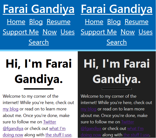
The thing which made the biggest difference is changing the background and “flipping” the font color.
@media (prefers-color-scheme: dark) {
    $hr-light: rgb(228,228,228);
    $my-bg: rgb(32, 32, 32);
    body {
        background-color: $my-bg;
        color: $hr-light;
    ...
    }
Note that I’m using Sass here and given that I’ll be reusing those colors quite a bit, I decided to make variables for them.

Note that the website header remains unchanged with the blue background.
Fixing The Bright Header
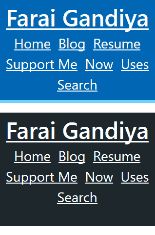
Looks dramatic at first, but that’s because of the background; the header is still bright blue. To fix that, I got rid of the border along with moving the rgb slider to some sort of dark-greenish blue color with rgb-value 28, 40, 461. Even though the delimiting border isn’t there anymore, it looks kinda different from the black background I chose to use.
@media (prefers-color-scheme: dark) {
    ...
    #site-header, #site-footer {
        background-color: rgb(28, 40, 46) !important;
        border: none !important;
    }
    ...
    }

The Horizontal Rule
Going back to the homepage, I noticed how the horizontal rule after the home page’s headline looked ugly. Shouldn’t have been shocked by that given that the rule was always black, but I was.
Thankfully it was a rather simple fix, although I needed many many styles to cover all the browser-specific quirks.
@media (prefers-color-scheme: dark) {
    ...
    hr {
        background-color: $hr-light !important;
        color: $hr-light!important;
        border-color: $hr-light !important;
    }
    ...
}
Isn’t really worthy of an image showing the difference to be honest. Then again, I used it more frequently than I thought so it probably is? Meh, I’m lazy.
Links
Another thing that really popped out to me was how bad the contrast between some of the links and the background is. I would have overlooked it had the contrast not been so stark and yet it was. The main changes here had to do with making the various link states more noticable.

Visited links turn from purple to pink, the unvisited link color becomes a softer blue and the focused outline is now white.
@media (prefers-color-scheme: dark) {
    ...
    a:focus {
        outline-color: $hr-light !important;
    }
    a:hover {
        background-color: white !important;
    }
    a:visited {
        color: pink;
    }
    a:link {
        color: rgb(121, 121, 246);
    }
    ...
}
Fixing the blockquote text.
Remember how I indiscriminately inverted the colors? Turns out that made all the text colors white for the most part, including in blockquotes which I hadn’t changed. Not really suprising, but it was. Thankfully the fix is trivial as I just removed the background color.
@media (prefers-color-scheme: dark) {
    ...
    blockquote {
        background-color: unset !important;
    }
    ...
}

Fixing the Tables
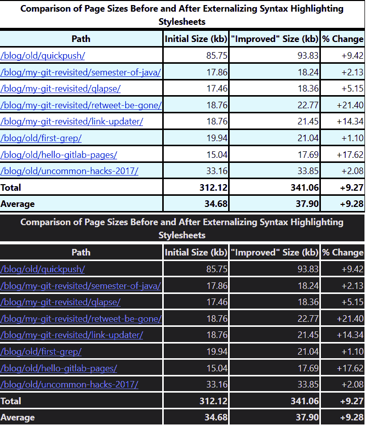
Another case where the indiscriminate color switch was a problem was in tables. The tables have a black border and a striped pattern on every other row with a light blue background. Besides being virtually unreadable, it also looks terrible. With a bit of CSS, it looks decent again.
@media (prefers-color-scheme: dark) {
    ...
    th, tr, thead, td, caption {
        background-color: unset !important;
        border-color: white !important;
    }
    ...
}

Why My Dark Mode Sucks
While I have dark mode now, it sucks. Here’s why:
!importantis overused– There is a way to structure CSS (one that wouldn’t use so many!importantstatements), but the way I did it isn’t one.- The website’s CSS is poorly structured–
- There’s no way to switch the theme in case someone doesn’t like it– which is likley because
- it’s ugly2.
I’ll fix dark mode when I start my great website redesign yet again.
The YouTube Channel
This blog post serves as an introduction of sorts to my new YouTube channel called… Farai Gandiya! Creative name I know but this is just until I can get a voice. The main focus will be programming but given that I’m trying to figure things out, there might be some tangents.
Help me out by subscribing to my YouTube channel and sharing my videos. I’ve got another ambitious goal of 12 videos by the end of the year, much like the 15 Blog Posts in 15 Days Challenge. The main subscriber goals I have are:
- 1 subscriber to prove that someone likes my videos and
- 1000 subscribers to unlock monetization.
Closest color I could find to it is Charleston green which is what the people of Charleston supposedly used after the American Civil War. Learned that from Wikipedia by the way. ↩︎
Or they find it harder to read. ↩︎